As the economy normalizes following a long, slow recovery from the Great Recession, we are quickly resuming our prerecession course of rising inequality. The fruits of economic growth are bypassing typical families and going straight into the hands of the already-rich.
Our current policy trajectory is doing nothing to reverse the trend of inequality. But it’s doing plenty to widen it. This year’s edition of Top Charts highlights how policy choices continue to exacerbate inequality and how we can achieve more broadly shared prosperity through better policy choices.
The upward march of inequality is firmly reestablishing itselfCumulative percent change in real annual earnings, by earnings group, 1979–2017
The dynamic of large but temporary earnings declines for the highest earners during the Great Recession reflects the composition of their pay packages. For CEOs and other executives in the top 1 and 0.1 percent, earnings include stock options and other compensation measures linked strongly to firms’ stock market performance. As the stock market fell rapidly during the recession, this led to a sharp decline in earnings. But as stock prices went back up, so did the earnings of the top 1 and 0.1 percent—and so did inequality.
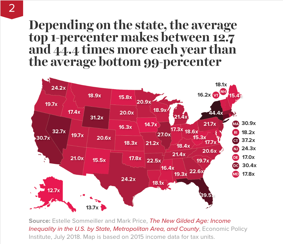
Depending on the state, the average top 1-percenter makes between 12.7 and 44.4 times more each year than the average bottom 99-percenter

Source: Estelle Sommeiller and Mark Price, The New Gilded Age: Income Inequality in the U.S. by State, Metropolitan Area, and County, Economic Policy Institute, July 2018. Map is based on 2015 income data for tax units.
The post–Great Recession recovery in top incomes—combined with unequal income growth since the 1970s—has America hurtling back toward levels of inequality that characterized the Gilded Age of the 1920s. In five states we’ve already surpassed Gilded Age levels of inequality. EPI research shows that in New York, Florida, Connecticut, Nevada, and Wyoming, the top 1 percent’s share of overall income tops the 1928 overall national record of 23.9 percent. Nationwide, the top 1 percent took home 22.0 percent of all income in 2015.
While the degree of income inequality differs across the country, the causes are mostly common and clear: intentional policy decisions to shift bargaining power away from working people and toward the top 1 percent.
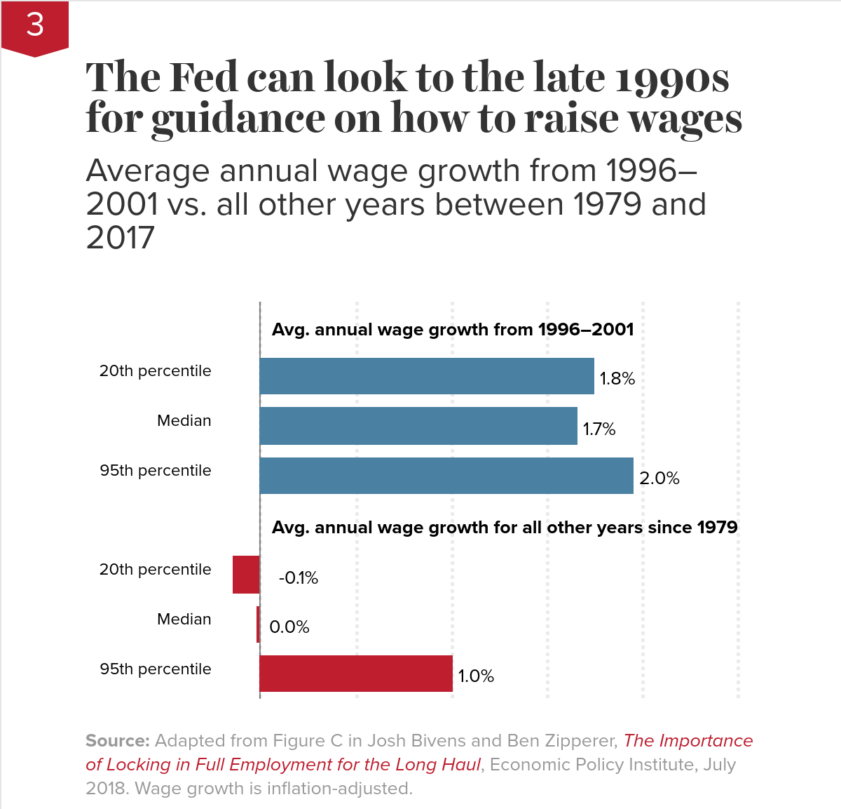
The Fed can look to the late 1990s for guidance on how to raise wagesAverage annual wage growth from 1996–2001 vs. all other years between 1979 and 2017
| Wage percentile | Avg. annual wage growth |
|---|---|
| 0% | |
| 20th percentile | 1.75% |
| Median | 1.66% |
| 95th percentile | 1.96% |
| 0% | |
| 20th percentile | -0.15% |
| Median | -0.02% |
| 95th percentile | 1.01% |
The most important difference was sustained low unemployment. The Fed kept interest rates low, allowing the unemployment rate to fall to levels far below what was considered sustainable for keeping inflation in check. And yet inflation did, in fact, remain in check. The late 1990s also saw an increase in the federal minimum wage, which helped boost wage growth at the bottom.
The Fed’s willingness to tolerate low unemployment, along with the boost to the minimum wage, paid enormous dividends in reducing inequality: annual wage growth for a 20th-percentile worker (1.8 percent) and for the median worker (1.7 percent) approximated that of a 95th-percentile worker (2.0 percent). In contrast, across all other years between 1979 and 2017, average annual wage growth for low- and middle-wage workers was essentially zero, while high-wage workers enjoyed consistently positive (if not hugely impressive) growth.
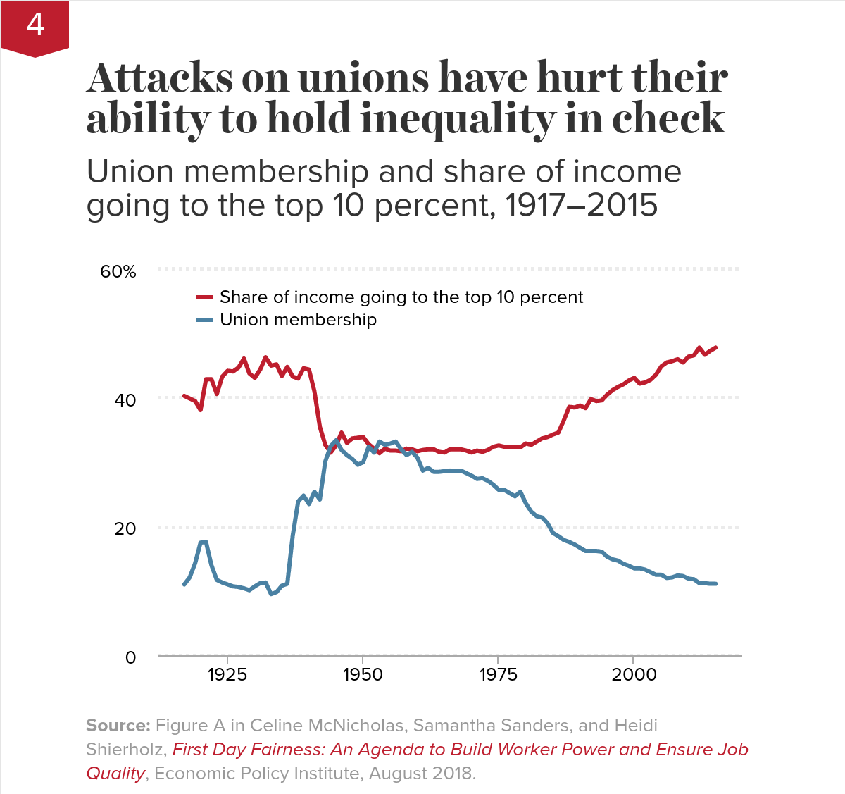
Attacks on unions have hurt their ability to hold inequality in checkUnion membership and share of income going to the top 10 percent, 1917–2015
As union membership has declined over the past 40-plus years, the top 10 percent have captured a greater and greater share of income. Breaking the momentum of rising inequality will require a much-strengthened labor movement. For lawmakers who will form a progressive majority in the U.S. House of Representatives in January 2019, the path is clear: enact ambitious reforms to the laws governing union organizing and collective bargaining to level the playing field and return bargaining power to workers.
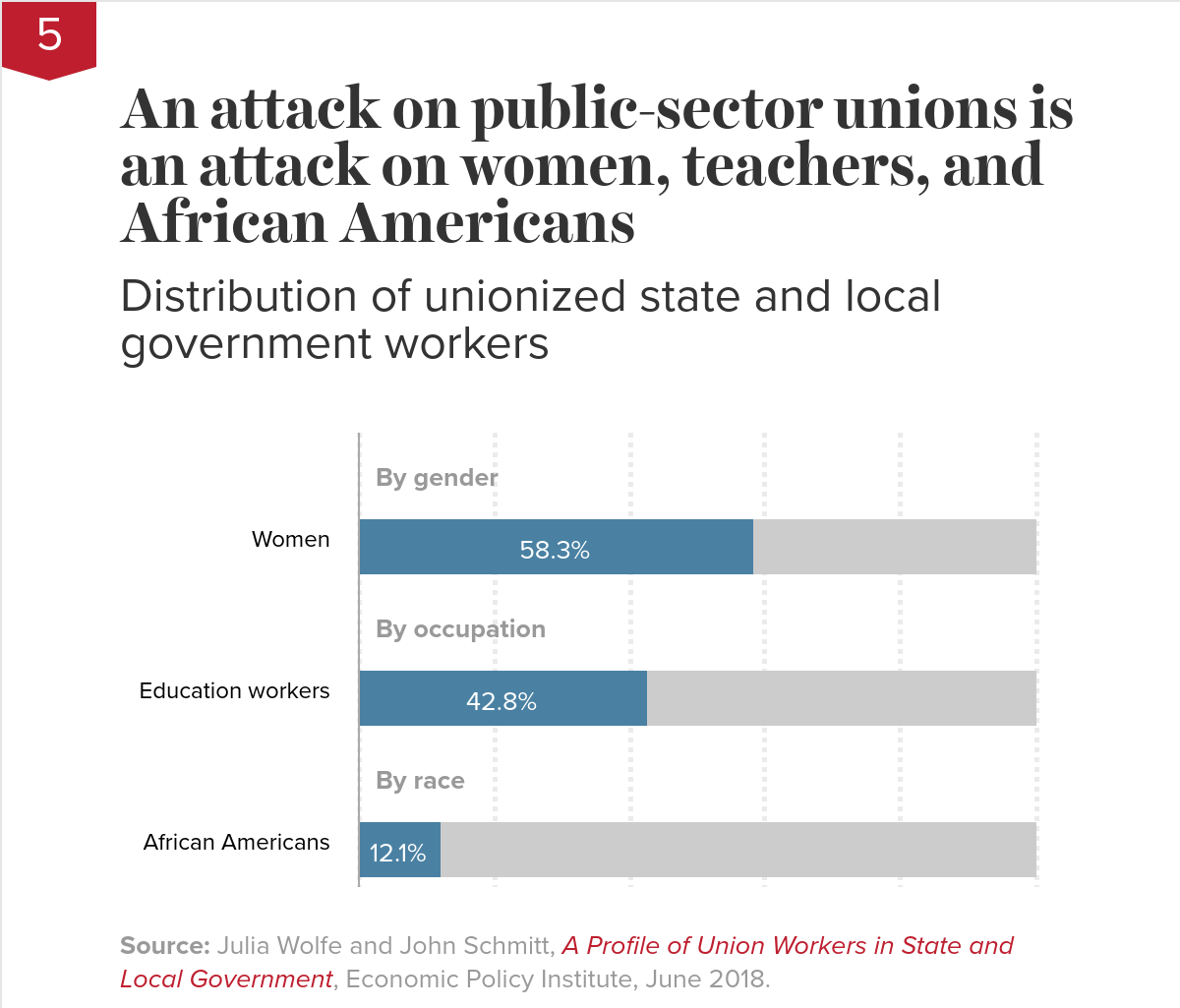
An attack on public-sector unions is an attack on women, teachers, and African AmericansDistribution of unionized state and local government workers
| Workforce | Percent of workforce | Rest of workforce |
|---|---|---|
| Women | 58.3% | 41.7% |
| Education workers | 42.8% | 57.2% |
| African Americans | 12.1% | 87.9% |
As this chart shows, this attack on state and local government unions constitutes an attack on women, teachers, and African Americans. Women and African Americans make up a disproportionate share of workers in the public sector who are represented by a union (relative to their shares of the private-sector workforce). And while teachers constitute the single largest subgroup of union workers in state and local government, union workers also include those serving the public as administrators, social workers, police officers, firefighters, and other professionals. The good news: actions policymakers take to bolster public-sector unions will disproportionately benefit women, African Americans, and teachers.
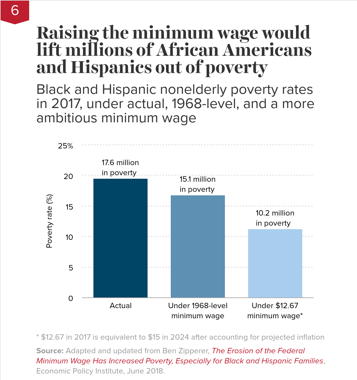
Raising the minimum wage would lift millions of African Americans and Hispanics out of povertyBlack and Hispanic nonelderly poverty rates in 2017, under actual, 1968-level, and a more ambitious minimum wage
| Black and Hispanic poverty | |
|---|---|
| Actual | 19.517836% |
| Under 1968-level minimum wage | 16.823694% |
| Under $12.67 minimum wage* | 11.325647% |
The inflation-adjusted value of the federal minimum wage is about 25 percent less today than it was at its peak in 1968. Had policymakers enacted adjustments to keep the 1968 minimum wage rising with inflation, the black and Hispanic poverty rate would be 14 percent lower today—meaning 2.5 million fewer blacks and Hispanics would be in poverty.
Policymakers have proposed going beyond simple inflationary adjustments to raise the federal minimum wage to $15 by 2024. If we had an equivalent policy in place today, we would lift 7.4 million blacks and Hispanics out of poverty.
The call to raise the minimum wage beyond its 1968 level is coming from more than just anti-poverty advocates. Supporters view it as a remedy for widening wage inequality. That’s because the minimum wage affects wages of low-wage workers and workers further up the wage scale by setting a wage floor. Adjusting this important labor standard upward would ensure that typical workers share more in our country’s economic growth.
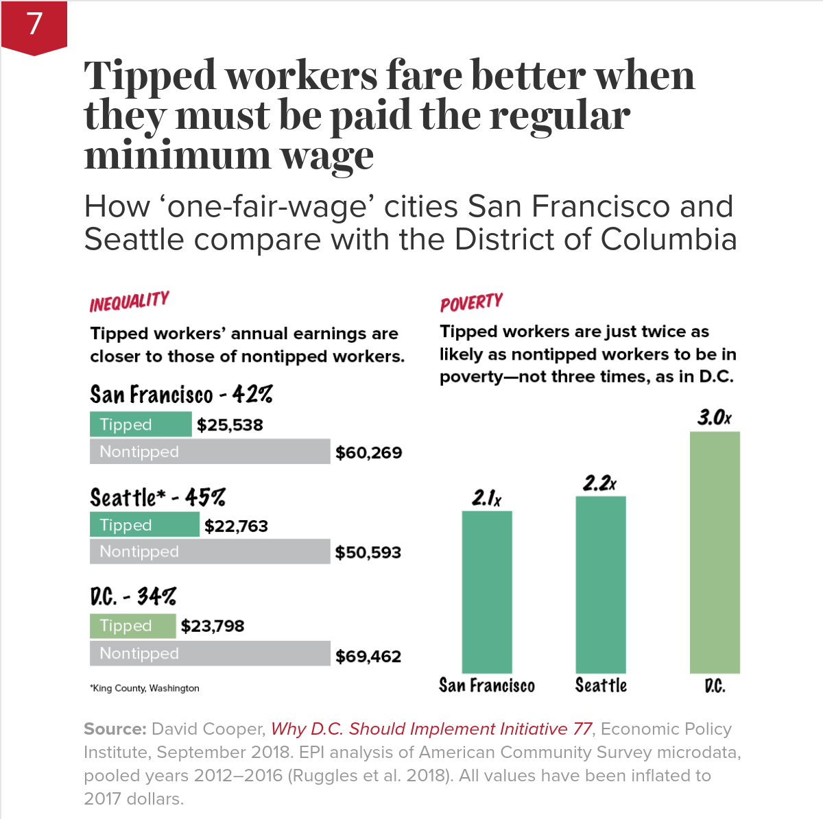
Tipped workers fare better when they must be paid the regular minimum wageHow ‘one-fair-wage’ cities San Francisco and Seattle compare with the District of Columbia

But recent proposals to move toward one fair wage in certain cities and states have been met with fearmongering. Critics claim that increasing the tipped minimum wage will destroy jobs or somehow even lower wages for workers in tipped industries. A ballot measure to bring one fair wage to Washington, D.C., was passed by voters but repealed by the city council—who used such claims to defend their decision to ignore the will of the voters.
The evidence behind these big claims is sorely lacking. But there is evidence refuting these claims. San Francisco and Seattle have both implemented one-fair-wage policies. Relative to D.C., there is less inequality between tipped workers and nontipped workers in Seattle and San Francisco, and tipped workers in these cities are much less likely than D.C. tipped workers to be in poverty.
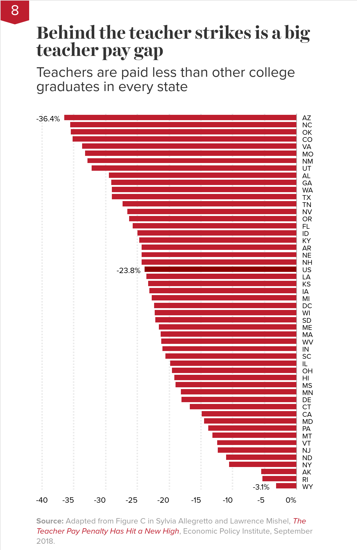
Behind the teacher strikes is a big teacher pay gapTeachers are paid less than other college graduates in every state
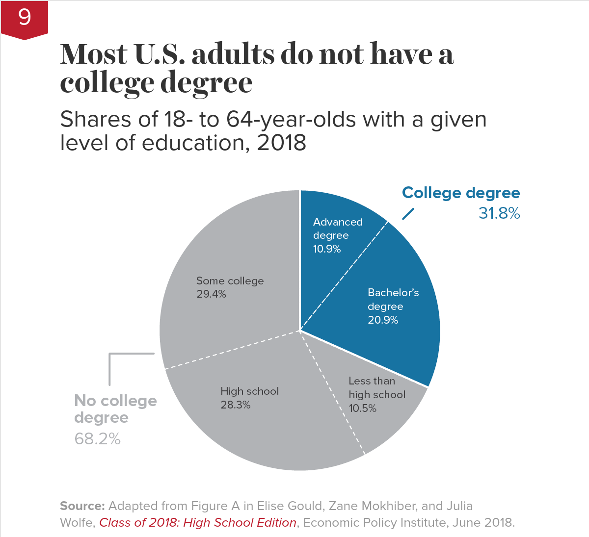
Most U.S. adults do not have a college degreeShares of 18- to 64-year-olds with a given level of education, 2018

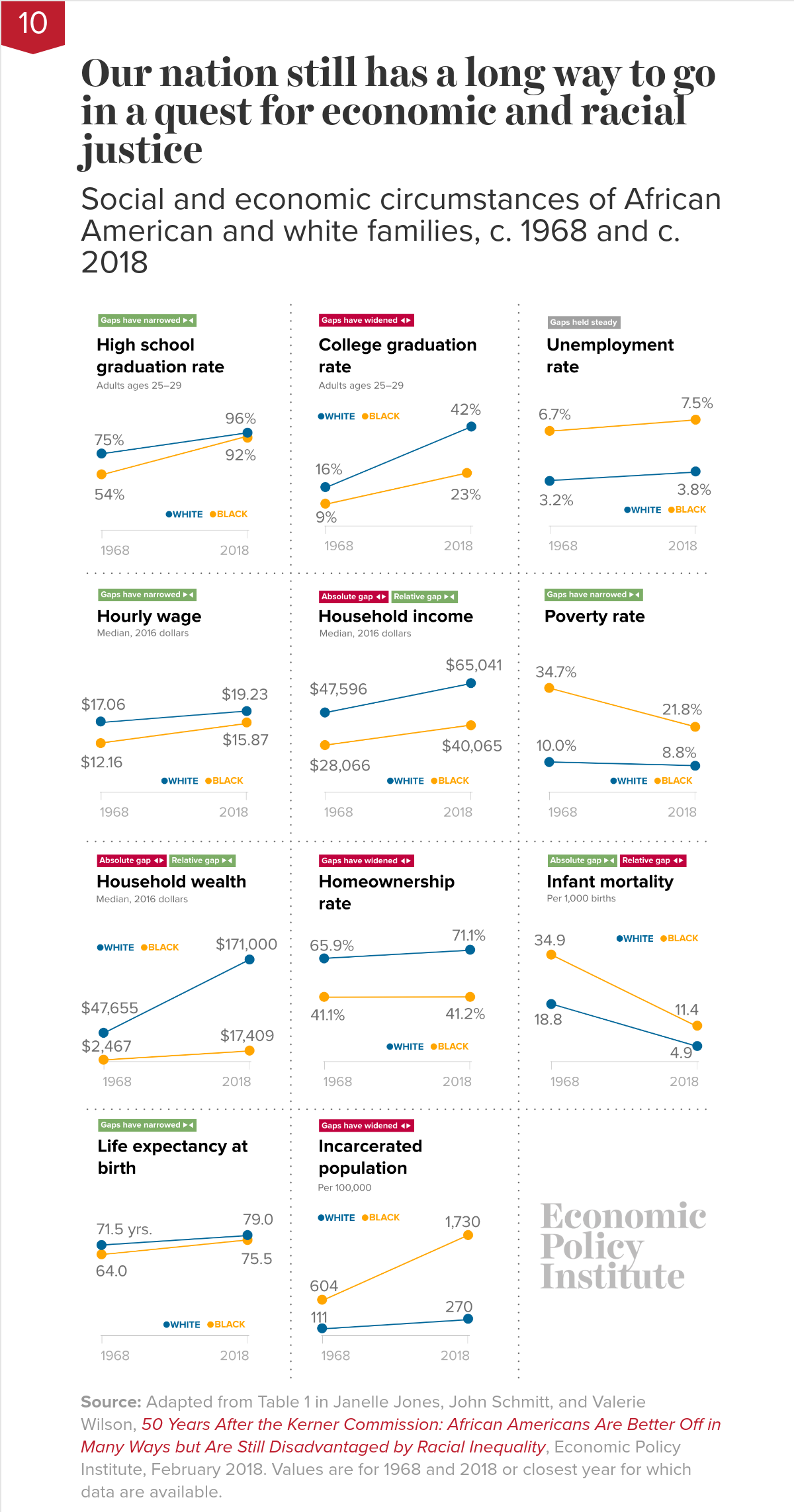
Our nation still has a long way to go in a quest for economic and racial justiceSocial and economic circumstances of African American and white families, c. 1968 and c. 2018

Not nearly far enough. The chart shows that, while African Americans are in many ways better off in absolute terms than they were in 1968, they are still disadvantaged in important ways relative to whites. African Americans today are much better educated than they were in 1968—but young African Americans are still half as likely as young whites to have a college degree. Black college graduation rates have doubled—but black workers still earn only 82.5 cents for every dollar earned by white workers. And—as consequences of decades of discrimination—African American families continue to lag far behind white families in homeownership rates and household wealth. The data reinforce that our nation still has a long way to go in a quest for economic and racial justice.
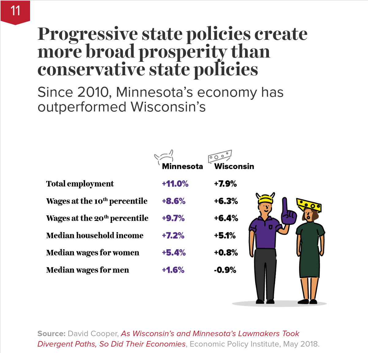
Progressive state policies create more broad prosperity than conservative state policiesSince 2010, Minnesota’s economy has outperformed Wisconsin’s

Source: David Cooper, As Wisconsin’s and Minnesota’s Lawmakers Took Divergent Paths, So Did Their Economies, Economic Policy Institute, May 2018.
Governor Walker and the Wisconsin state legislature pursued a highly conservative agenda centered on cutting taxes, shrinking government, and weakening unions. In contrast, Minnesota lawmakers under Governor Dayton enacted a slate of progressive priorities: raising the minimum wage, strengthening safety net programs and labor standards, and boosting public investments in infrastructure and education, financed through higher taxes (largely on the wealthy). The evidence shows clearly superior performance—faster wage and employment growth—in Minnesota.
The Trump tax cuts didn’t increase investment—but they did increase corporate profit hoarding
The top half of the figure shows undistributed corporate profits as a share of corporate-sector value-added (where value-added is a measure of all income—either wages or profits—generated by a corporation). Undistributed corporate profits are profits not immediately passed through to shareholders as dividends and thus available for investing in plants and equipment, or buying back shares of stock, or for other financial engineering. These undistributed profits soared in the wake of the TCJA, largely because it allowed a tax-free repatriation of profits that had been stored offshore. (A similar tax holiday in the mid-2000s led to a similar spike in undistributed profits.)
The bottom half of the figure shows where this profit bonanza did not end up—in investments in productive plants and equipment. The quarterly investment growth rate shows no indication that investment is shifting into a higher gear because of the tax cut.